
alyssa terry // communication designer // detroit, mi
hi friends! my site is currently under construction so please be mindful of any missing content, typos or broken links!! thanks in advance :)
hi friends! my site is currently under construction so please be mindful of any missing content, typos or broken links!! thanks in advance :)
Root N’ Toot
(Type Design)
(font design, typography, HFM, slab serif, gothic tuscan, collaboration)
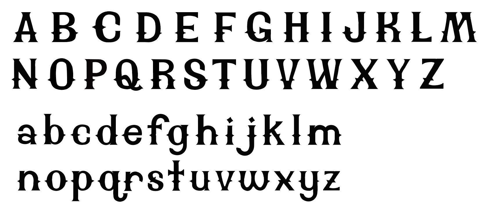
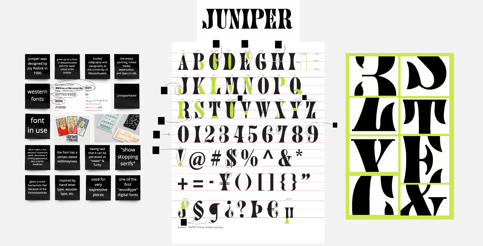
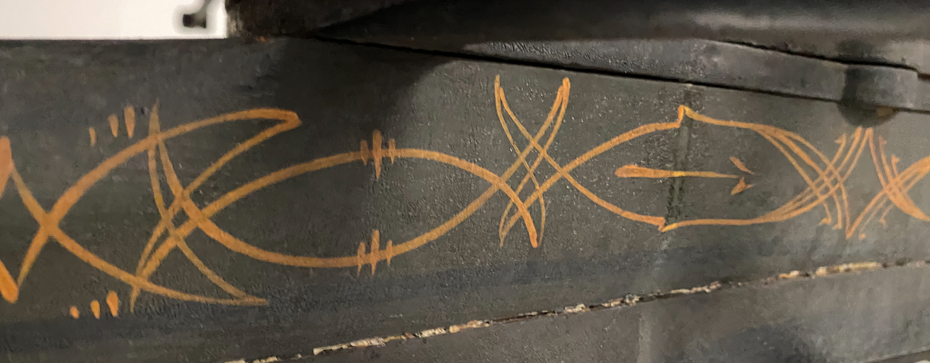
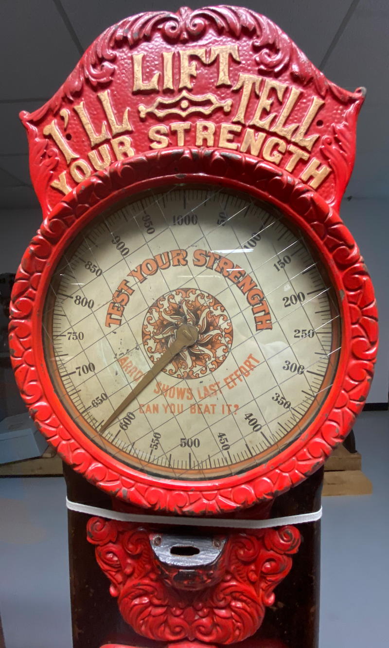
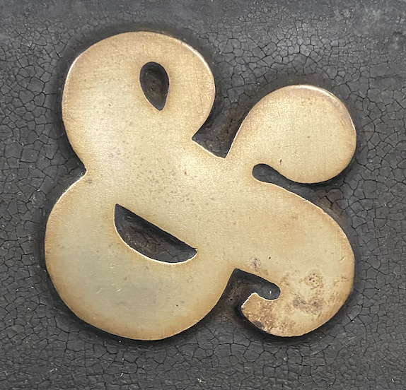
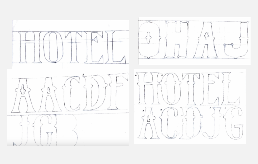
Content: In partner with the Henry Ford Museum, I curated a select group of typographic specimens from their archive to gather inspiration for in the creation of this typeface. I specifically focused on caputuring the western style of 60s and 70s typography. I named the font Root N’ Toot as an ode to the funky details of typography during this time. These last spreads are in collab. with my entire class. We each have our own individual portions together in a book and newspaper series.
Process: I went to the museum and photographed typography to begin sketching the bare bones of my typeface. I also chose to develope a second case which is a lowercase matching. The pieces from the uppercase letters made the process of creating the lovercase forms much easier.
Takeaways: This was a semester long process of developing this typeface and it took a lot of time but honestly was overall and enjoyable experience for me. There were are lot of refinements and small tweaks that needed to be made to individiual letterforms and I honestly enjoyed this tedious process.
Takeaways: This was a semester long process of developing this typeface and it took a lot of time but honestly was overall and enjoyable experience for me. There were are lot of refinements and small tweaks that needed to be made to individiual letterforms and I honestly enjoyed this tedious process.
︎ type tracing study & research

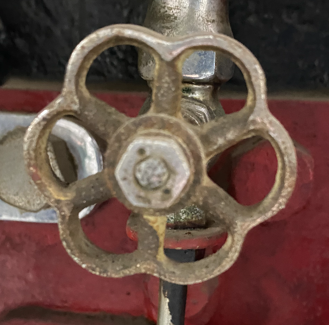
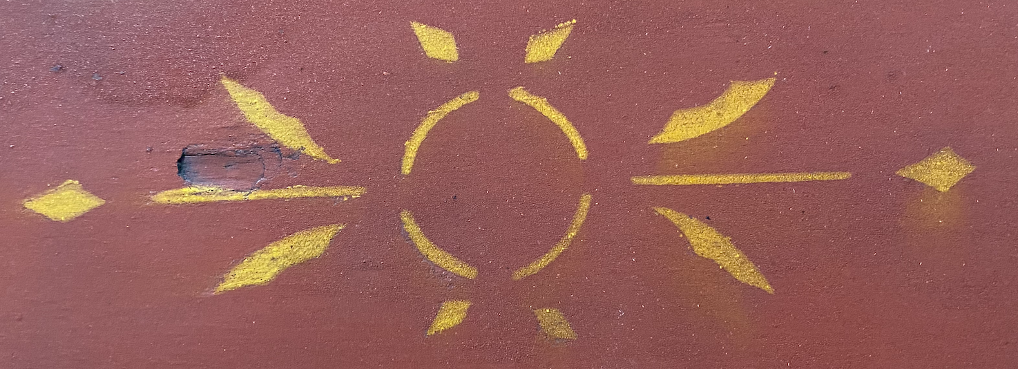
︎ visiting the Henry Ford archive highlights for inspiration


︎ moodboarding establishing style
contemporary references


︎ sketching
pencil sketches
digital sketches


︎ process
newspaper


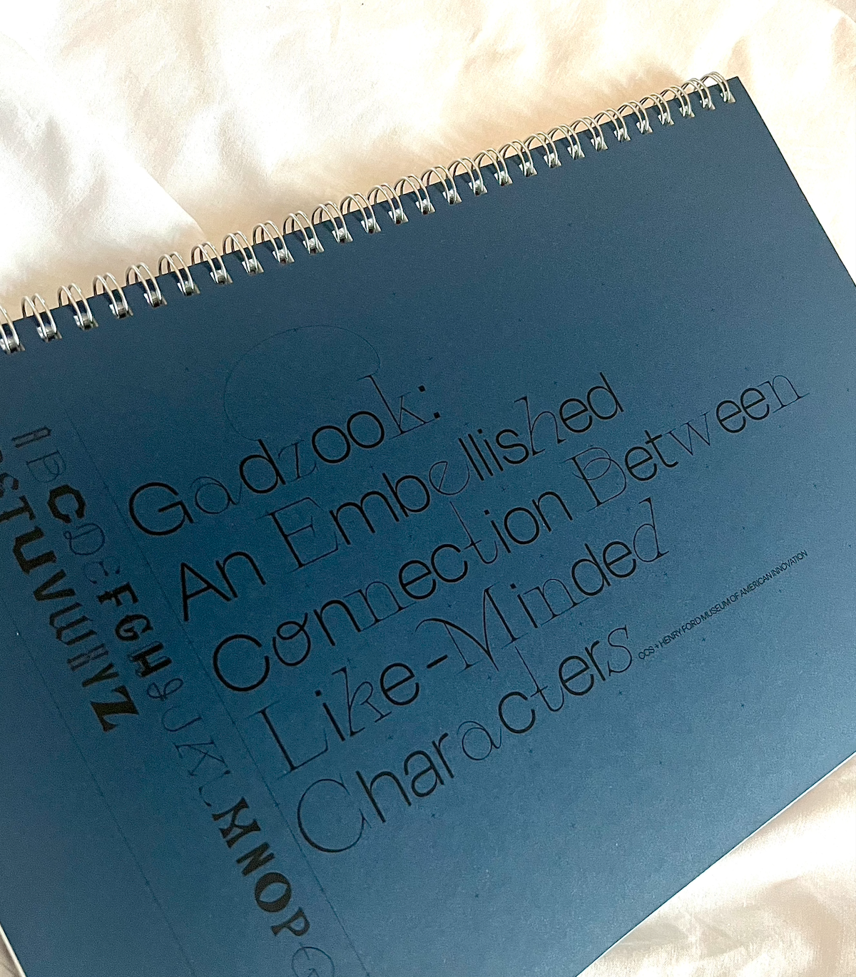
︎ gadzook! a font book of student made fonts spread highlights with Root N’ Toot


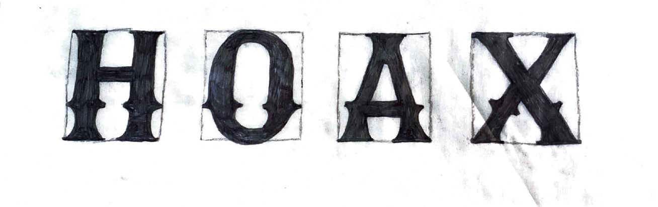
︎ final iteration of Root N’ Toot uppercase
lowercase
numbers
glpyhs